It’s been far too long since I wrote anything meaningful on this blog, so I have decided that this will be my last post. I have really enjoyed researching and writing on here but I now blog on other websites and find little time to contribute to this one. If anyone is looking for more climate or Earth-science blogs then I would thoroughly recommend the European Geosciences Union blogging network. I have written the GeoPolicy column there for a little over a year now. The blog network is full of information about climate, geoscience, and the scientists working in these fields.
Thank you for reading and thanks for your comments.
This week I wrote a blog post for the Cambridge Centre for Climate Science (CCfCS). It’s a summary of an afternoon of talks about the IPCC 5th annual report on climate change. The event was organised by both the CCfCS and the Cambridge Institute for Sustainable Leadership (CISL). UPDATE: the link to the website has broken so I have copied and pasted my report below.
A more detailed summary of both Working Group 1 (The Scientific Basis) and Working Group 2 (Impacts and Adaptation) can be found in previous posts I’ve written.
This week the Cambridge Centre for Climate Science (CCfCS) and the Cambridge Institute for Sustainable Leadership (CISL) hosted an afternoon of presentations and discussions about the 5th Intergovernmental Panel on Climate Change (IPCC) report (AR5). The meeting coincided with the release of the ‘Synthesis’ report which was the final document to be released for AR5.
The meeting was organised by Dr Michelle Cain (CCfCS) and chaired by Dr Eliot Whittington (CISL). Four speakers spoke about the three working group reports and the IPCC’s impact on policy. A panel discussion followed where audience members could ask questions and give comments. Lastly, the afternoon concluded with an opportunity for networking over a wine reception.
The first of the four speakers was Prof. Eric Wolff from the Department of Earth Sciences, formally from the British Antarctic Survey. Professor Wolff gave a clear summary of the working group (WG) 1 report which assesses ‘The Physical Science Basis’, as well as a brief overview of the history of the IPCC. The IPCC is a UN indorsed organisation set up by the United Nations Environment Program (UNEP) and the World Meteorological Organisation (WMO) in 1988. The published reports released every ~5 years aim to assess “the scientific, technical and socio-economic information relevant to understanding the scientific basis of risk of human-induced climate change“.
WG1 discusses both past and present observations are conducted, and how the use of complex computer models help to understand the climatological processes occurring in the world. Observations including sea ice extent, atmospheric and ocean temperature, ocean acidity and sea level show concurrently the world is warming. The rate of change is at least 10 times faster than the warming from the last ice age. Computer analysis shows that these observed changes cannot be replicated without the consideration of anthropogenic interactions to the environment (i.e CO2 has risen 40% in the last two centuries). Future ‘pathways’ the world can adopt show at least a 2 degree warming by the year 2100, if an aggressive strategy is adopted to reduce GHG emissions. A ‘business as usual’ pathway shows an increase of 4-5 degrees. This would have major impacts on the world as the last ice age was only 5 degrees cooler than today.
The second speaker was Prof. Douglas Crawford-Brown from the Cambridge Centre for Climate Change Mitigation Research who summarised the WG2 report: Impacts, Adaptation and Vulnerability. Five themes (listed below) regarding impacts were addressed in this report. The report was criticised however for not addressing each theme with equal weighting.
Unique and threatened systems
Extreme weather events
Distribution of impacts
Global aggregate impacts
Large scale singular effects
Both global and regional impacts were addressed and the idea of ‘risk’ was commonly used as an analytical framework throughout the report, whereas in 2009 the AR4 WG2 report concentrated more on pure relevance scenarios. Future impacts were discussed using the same pathways described in the WG1 report. A region’s vulnerability and ability to adapt was also assessed.
The WG3 report: Mitigation of Climate Change, was summarised by the third speaker Dr David Reiner from the Energy Policy Research Group in the Judges Business School. Dr Reiner started his talk by advising that for this WG the technical summary (TS) which, although longer, provides a more detailed analysis of the scientific data than the summary for policy makers. The report starts by explaining that GHG emissions are continuing to rise on the global scale despite many reduction policies in place. This is due to increasing emission rates from more developing nations. Dr Reiner explained that the primary purpose of WG3 was to assess multiple mitigation pathways and its impact on the economy. Global baseline projections for the Kaya factors (population, GDP per capita, energy use per unit of GDP, carbon emissions per unit of energy consumed) were also shown in the report. An attempt to quantify the economic cost of mitigation strategies and other co-benefits to reducing GHG emissions (e.g better air quality) were also highlighted. Of the three working group reports, the third was the least well reviewed after publication, with the economic models being questioned.
This was also mentioned in the final speaker’s talk ‘A policy perspective on the IPCC’ by Prof David MacKay who was the former chief scientific advisor to the Department for Energy and Climate Change (DECC), and now works in the Engineering Department of Cambridge University. Professor MacKay provided constructive criticism for some areas of improvement for future reports. The quantification of risk and the clarification of uncertainty were stressed to be particularly useful for determining future policies.
A panel discussion, lasting ~90 minutes, allowed the audience to ask questions and offer comments. Topics including carbon sequestration, the format of future IPCC reports, the role of both public and private sectors in CC mitigation, and the portrayal of scientific facts and figures were all addressed. Less formal discussions then continued at the wine reception.
More information about the three working group reports can be found in their respective technical summaries (TS) or their summary for policy makers (SPM):
Cows are notorious for the amount of methane they produce. Methane is a powerful greenhouse gas (GHG), but just how much do cows actually give off and how does this compare to other methane emission sources? This post tries to give an overview of all things methane and cows..
Where does the methane come from?
The plant diet of cows and other ruminants is high in cellulose, which cannot be digested by the ruminant itself. However, ruminants have a symbiotic relationship with colonies of microorganisms, called methanogens, which live in their gut and break down the cellulose into carbohydrates.. These carbohydrates provide both the microbial community and the ruminant with an energy source. Methane is produced as a by-product of this process.
A common misconception is that the cow’s rear end emits methane, however the vast majority is released orally. Researched carried out by Grainger et al. in 2007 found that 92-98 % was emitted orally (I won’t go into detail about how they found that out!). It is also wrong to think that all bovines emit the same amount of methane but I will go into this in more detail later on in the post.
Global Bovine Emissions
Global emissions of methane were estimated to be between 76 – 92 Tg per year (1 Tg = 1 million metric tonnes). This is roughly equal to ~10-15 % of global methane emissions, which in turn is ~15 % of global GHG emissions. Methane is a more potent GHG than CO2, which means that gram for gram methane warms the atmosphere more than CO2. Methane also has a much shorter lifetime in the atmosphere compared to CO2 (~10 years compared to 100s of years) which will produce more rapid impacts on the global climate. This also means that any reductions in methane emissions will see a faster decrease in atmospheric concentrations than compared to CO2.
Dairy vs. Beef (and some other animals)
The table and figure below compares farmed animals in the UK and their contribution to methane emissions per animal per year in kilograms. A dairy cow emits over twice the amount of methane than a beef cow and is by far the highest contributor of all the animals studied. There are also more dairy cows in the UK than beef cattle (1.81 million compared to 1.66 million). All data found from the UK GHG Inventory report 1990-2012. Other research has shown that cows emit methane at regular times of the day, specifically during feeding and milking. Although these figures do not take into account farming and transport GHG emissions and the actual amount of milk each animal produces, perhaps it would be better to buy goat milk? Although the more preferable metric of Carbon per Litre would allow a more concrete conclusion on this point.
Kg CH4
# Dairy Cows
Pigs
1.5
74
Goats
5
22
Sheep
8
14
Beef
50.5
2
Dairy
110.7
1
Graphics credit to @OatJack.
Future Bovine Emissions
Future methane emissions are almost certainly expected to increase due to global food demand increasing from population growth. Developed nations also consume more meat, developing nations are thus expected to increase their meat consumption in future years.
Methods to reduce methane emissions from cows are summarised in the table below (taken from Reay’s book Methane and Climate Change). These have been classified into short term (available now), medium term (available in ten years) and long term (not commercially available for at least another ten years). Many of these suggestions have been disputed as they are not economically viable, especially in developing nations.
Short Term
Medium Term
Long Term
Reduce animal numbers
Rumen Modifiers
Targeted manipulation of rumen ecosystem
Increase productivity per animal
Select plants that produce lower methane yield by the animals
Breed animals with low methane yield
Manipulate diet
Rumen Modifiers
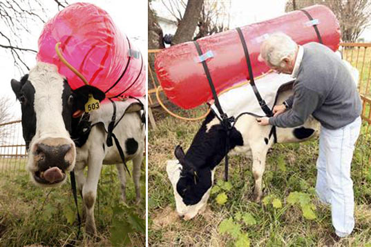
An alternate pathway would be to try and capture emissions from cows. A dairy cow can produce up to 400 litres of methane per day! When burned, this is enough energy to power a small fridge for a day. Some scientists have harnessed methane emitted from cows in backpacks (see photo and video below) however scaling this up to all 10 million cows (this includes all calves, young bulls etc in the UK alone) could be problematic!
Last week the UN 2014 Climate Summit was hosted in New York. The purpose of this meeting was “to raise political momentum for a meaningful universal climate agreement in Paris in 2015 and to galvanize transformative action in all countries to reduce emissions and build resilience to the adverse impacts of climate change”. Various marches all around the world were also organised to coincide with this summit to raise public and political awareness of the meeting.
The UN Secretary General Ban Ki-Moon gave the closing summary speech which is available to read on the United Nations Framework Convention for Climate Change (UNFCCC) website. His summary includes details on various pledges by member states to cut emissions and to aid economical growth world wide. It’s worth a read if you have a chance.
The IPCC (Intergovernmental Panel on Climate Change) consists of three working groups who publish reports every 6 years describing the current understanding of all aspects of climate change (CC). The previous blog post (Key Figures from the IPCC’s AR5 Report) gives an introduction into the IPCC and explains the key figures published by the First Working Group last winter which concentrates on the scientific evidence of CC. This blog post summarises the highlights from the Second Working Group (WG2) which aimed to assess the risks associated with CC, particularly Impacts, Adaptation and Vulnerability.
WG2’s Summary for Policy Makers, which this post is based upon, assesses relevant scientific, technical and socioeconomic literature. Such literature is comprised of empirical observations, experimental results, process-based understanding, statistical approaches, simulation and descriptive models as well as expert judgement.
NB: For descriptions of the confidence and certainty values mentioned in this post please see this previous post on the WG1 report.
Current Observed Impacts, Vulnerability, and Exposure
The figure below summarises the observed impacts around the world in the last few decades. A hollow symbol means that the evidence suggests CC has had a minor impact, and a filled symbol represents a major CC contribution. The rectangular bars beside each symbol represent the confidence associated with each impact. A summary of the major themes found throughout the impacts stated on this map are listed below. All statements are stated to have high or medium confidence levels.
Changes in precipitation or melting snow / ice is altering some regions’ hydrological systems, which can affect water resources and quality.
Many species have shifted their geographic ranges, seasonal migration times, abundances etc. A few species have become extinct due to current CC.
Negative impacts of CC on crop yields currently outweigh positive impacts. Positive impacts are mainly localised to the Northern hemisphere higher latitude regions.
Currently, the impact of CC on worldwide human health is minimal when compared with other contributing factors. It should be noted that there has been an increase in heat related mortality and a decrease in cold related mortality.
Climate extremes, for example, heat waves, droughts, floods (which are expected to increase in the future) are a significant vulnerability for some ecosystems.
Climate related hazards aggravate other stressors that impact human life, especially for people living in poverty. For example, food price increases due to lower crop yields. Observed positive impacts are limited and often indirect, for example, diversification of agricultural practices.
Widespread impacts in a changing world. (A) Global patterns of impacts in recent decades attributed to climate change, based on studies since the AR4. Impacts are shown at a range of geographic scales. Symbols indicate categories of attributed impacts, the relative contribution of climate change (major or minor) to the observed impact, and confidence in attribution.
The following diagram shows regional examples of the impacts described in the previous paragraph. For a more comprehensive list of impacts please see the Summary for Policy Makers Table 1. All statements listed below have confidence levels shown in brackets after each impact.
The figure below shows the average percentage change in crop yield. The two blue bars to the left show all crops grouped as growing in tropical or temperate climates. The four orange bars on the right are the most common crops worldwide. It has been observed on the whole that CC has had a negative impact on yields of most crops worldwide.
(C) Summary of estimated impacts of observed climate changes on yields over 1960-2013 for four major crops in temperate and tropical regions, with the number of data points analyzed given within parentheses for each category.
Risks in the Future
The second half of the summary for policy makers concentrates on the future risks and possible benefits CC will bring to the world. The magnitude and rate of CC is also taken into consideration. The IPCC Working Group 1 used four representative concentration pathway (RCP) scenarios to predict the average global temperature leading up to 2100. For definitions of the RCP scenarios please read my last post. The following risks predicted by the WG2 all occur in at least one of the RCP scenarios and all possess high confidence levels.
Risk of death, injury, ill-health, or disrupted livelihoods in low-lying coastal zones and small island developing states and other small islands, due to storm surges, coastal flooding and rising sea level.
Risk of severe ill-health and disrupted livelihoods for large urban populations due to inland flooding in some regions.
Systemic risks due to extreme weather events leading to breakdown of infrastructure networks and critical services such as electricity, water supply, and health and emergency services.
Risk of increases in mortality and disease during periods of extreme heat, particularly of vulnerable urban populations and those working outdoors.
Risk of food insecurity and the breakdown of food systems linked to warming, drought, flooding, and precipitation variability and extremes, particularly for poorer populations in urban and rural settings.
Risk of loss of rural livelihoods and income due to insufficient access to drinking and irrigation water and reduced agricultural productivity, particularly for farmers and pastoralists with minimal capital in semi-arid regions.
Risk of loss of marine and coastal ecosystems, biodiversity, and the ecosystem goods, functions, and services they provide for coastal livelihoods, especially for fishing communities in the tropics and Arctic.
Risk of loss of terrestrial and inland water ecosystems, biodiversity, and the ecosystem goods, functions, and services they provide for livelihoods.
Many key risks constitute particular challenges for the least developed countries and vulnerable communities, given their limited ability to cope.
Future Risks by Sector
Freshwater resources: Risks increase significantly as concentrations increase (robust evidence, high agreement). Renewable surface- and groundwater resources are expected to decrease over the 21st century especially in subtropical dry regions which would intensify competition for water supply (limited evidence, medium agreement).
Terrestrial & freshwater ecosystems: Both ecosystems are expected to have a large fraction facing extinction risks during and beyond the 21st century. This is because CC can have an impact on other factors such as pollution, invasive species etc. (high confidence). There is also the risk of abrupt and irreversible regional-scale change in the higher RCP scenarios (medium confidence).
Coastal & low-lying areas: Rising sea levels are predicted throughout the 21st century. Coastal and low-lying areas will therefore increasingly experience adverse impacts such as flooding and coastal erosion (very high confidence).
Marine systems: Global marine-species redistribution and marine-biodiversity reduction will challenge the sustained provision of fisheries productivity (high confidence). For medium to high RCPs, ocean acidification will cause substantial risks particularly to coral reefs and polar regions (medium – high confidence).
Food security & food productions systems: Major crops will see a negative impact on production without adaptation, however individual locations may benefit (medium confidence). All aspects of food stability are affected by CC, including food access and price stability (high confidence).
Urban areas: Urban areas are affected by many CC risks (medium confidence). Risks are amplified for those lacking appropriate infrastructure, those in poor quality housing and in exposed areas (medium confidence).
Rural areas: Rural areas are exposed to both near- and long-term risks from CC. These impacts include water availability, supply and food shortages (high confidence).
Key economic sectors & services: For economic sectors, other stressors, including population, technology, relative prices etc. will be larger than the impacts of CC (medium confidence). Global economic impacts from CC are very difficult to estimate. The most recent, but still incomplete, estimates predict an increase of ~2 oC would have a negative economic effect of between 0.2 and 2 % of income (medium evidence, medium agreement).
Human health: Until mid-century CC will impact human health by exacerbating current health issues (very high confidence). It is expected to increase throughout the 21st century in many regions, especially developing countries with low income (high confidence).
Human security: The displacement of people is expected to change due to CC (medium evidence, high agreement). CC can increase violent conflicts in the form of civil war by amplifying well-documented drivers of these conflicts such as poverty and economic shocks (medium confidence).
Livelihoods & poverty: Throughout the 21st century CC is expected to reduce economic growth, make poverty reduction more difficult and further erode food security (medium confidence).
Future Surface Temperature Scenarios
The following diagram shows how the Earth’s temperature has changed in the last ~110 years (Part A). Any area with insufficient data was left white and any statistically insignificant temperature change is shown with hatched lines. The second diagram in the figure below (B) shows two of the RCP scenarios and how the world’s average temperature could increase whilst following these scenarios. The blue is considered the ‘best case’ scenario where countries adopt a very strict reduction of greenhouse gas (GHG) emissions whereas the red is a ‘carry on as normal’ scenario. The third part to this figure (C) shows two plots much the same as in part A but the two RCP scenarios have been used to show how the Earth’s surface temperature can change depending on what mitigation techniques are adopted. The percentage temperature increase is taken from the average of the Earth’s temperature from 1986-2001. The key things to note from this figure is how dramatically different the future climate could be and how uneven the warming across the world is (for example, the Northern Hemisphere warms much more than the Southern Hemisphere).
Observed and projected changes in annual average surface temperature. This figure informs understanding of climate-related risks in the WGII AR5. It illustrates temperature change observed to date and projected warming under continued high emissions and under ambitious mitigation.
Future Fishing Scenarios
The final figure in this post shows the possible changes to fishing by the middle of this century. The plot shows the redistribution of the maximum catch potential for over 1000 fish species caught worldwide, and is compared to the 2001-2010 baseline value. The values calculated here are based upon one of the more extreme RCP scenarios. Coastal regions and seas in north-western Europe and other mid- to high-northern latitudes will see an increase in maximum catch potential as more warm-water species migrate northwards. There will be a sharp decrease in maximum catch in the equatorial regions and around the South Pole with differences being as small as half the expected value of the 2001-2010 mean.
Climate change risks for fisheries. (A) Projected global redistribution of maximum catch potential of ~1000 exploited fish and invertebrate species. Projections compare the 10-year averages 2001-2010 and 2051-2060 using SRES A1B, without analysis of potential impacts of overfishing or ocean acidification.
The IPCC WG2 also goes into detail about adaptation strategies however these have not been covered in this blog post. For more detail on this I suggest Section C of the Summary for Policy Makers. The third and final report by the Working Group 3 (WG3) has been published, and concentrates on potential mitigation choices – the subject of my next post.
The IPCC (Intergovernmental Panel on Climate Change) was set up in 1988 by member governments and established by the World Meteorological Organization (WMO) and the United Nations Environment Programme (UNEP). Its objectives were, and still are, “to assess on a comprehensive, objective, open and transparent basis the scientific, technical and socio-economic information relevant to understanding the scientific basis of risk of human-induced climate change“ (From the Principles Governing IPCC Work). Briefly, the IPCC wants to see how the climate it changing, whether humans are contributing to this change and, if so, how much and what are the impacts on the Earth. The reports that are published every 6 years are based on published scientific research from across the world. Each IPCC report is subdivided into three parts which concentrate on 1) the physical science basis, 2) impacts, adaptation and vulnerability and 3) mitigation of climate change. The most recent report, the 5th (AR5), had its Working Group 1 analysis published in September 2013. It is from this report that the figures I explain in this blogpost originate. To give a sense of scale, AR5 has over 800 contributing scientific authors from over 80 different countries. More than 9000 peer reviewed scientific papers contributed to the reports and over 100,000 comments were made and replied to. In terms of scientific review groups, nothing this comprehensive has been achieved on such a scale in any other discipline. The video below was produced when the Working Group 1 report was published. It gives an overview of the scientific reasoning behind the major statements in the report summary.
Understanding the Terminology
If you have read any news coverage of the AR5 report, or perhaps the ‘Summary to Policy Makers’ you will see it is full of phrases such as ‘extremely likely’ and ‘medium confidence’. These terms all have numerical definitions which are summarised in the figures below, for example, extremely likely has a value of between 95-100% certainty. The values will have been calculated using evidence based on observations, computer models results and scientific expert opinion.
Key Figures in the IPCC AR5 Working Group 1 report
All figures shown below can be found in the Summary to Policy Makers report. All the evidence stated above have been combined and assessed to determine the headline statement of the IPPC AR5 that human contribution to climate change is now extremely likely.
Temperature record of the land, ocean and surface from 1850-2012
Figure SPM.1: (a) Observed global mean combined land and ocean surface temperature anomalies, from 1850 to 2012 from three data sets. Top panel: annual mean values, bottom panel: decadal mean values including the estimate of uncertainty for one dataset (black). Anomalies are relative to the mean of 1961−1990.
This first plot is fairly self-explanatory. It shows the temperature records based on observational evidence for the land, surface (air closest to the ground) and oceans combined. For more information about temperature records that go further back in time, my previous post entitled ‘4.5 Billion Years of the Earth’s Temperature’ has figures and explanations that may interest you. The temperature values are shown as relative to the average temperature from 1961-1990. The period from 1961-1990 is defined as a ‘normal period’ which is an average value from a 30 year duration. A normal period must have an accurate representation of the present-day or recent average climate. This period should feature a range of climatic variations, including several weather anomalies (for example, severe droughts or cool seasons). 1961-1990 is the official normal period adopted by the WMO. For more information about how these periods are defined please see here. The top figure shows the temperature values as annual data points but the bottom has been averaged into decadal (10 year) values (the different colour lines showing different data sets used). The longest data set we have is the one in black, the grey shaded areas shows the spread in uncertainty associated with this data set. You can see the spread of the shaded area is larger the further back in time you go, showing how our confidence in our observations has improved as more robust measuring techniques are introduced. The first seven decades (the Industrial Revolution) show almost no trend in temperature (if anything a slight decrease in global values) however temperature rises from the 1920s to the 1950s. A plateau is then observed for a few decades before values dramatically rise to present day values. The last three decades have been warmer than any other decade in the last 150 years.
Surface temperature change from 1901-2012
Figure SPM.1: (b) Map of the observed surface temperature change from 1901 to 2012 derived from temperature trends determined by linear regression from one dataset (orange line in panel a). Trends have been calculated where data availability permits a robust estimate (i.e., only for grid boxes with greater than 70% complete records and more than 20% data availability in the first and last 10% of the time period). Other areas are white. Grid boxes where the trend is significant at the 10% level are indicated by a + sign. For a listing of the datasets and further technical details see the Technical Summary Supplementary Material. {Figures 2.19–2.21; Figure TS.2}
This figure gives more information than the one before by showing where in the world the temperature change is occurring. It is sometimes assumed that the rate of global warming is the same throughout the world, but this is not the case. You can see the most intense warming occurs over large land masses. It should be noted that the areas marked with a + sign show when the temperature change is above 10% of the starting temperature which indicates a relatively significant change. Not all areas of the world are warming however, as the blue indicates in the North Atlantic Ocean, there are also certain parts of Antarctica that are cooling but this is not shown in this diagram. As stated in the figure description, the white regions are where <70% of the total data set is recorded and more than 20% of the total data set is in the first and last time periods. Without this information the exact value of temperature change cannot be calculated. This is not to say scientists do not know if these regions are warming or cooling, but the values calculated are not robust enough to the stated here.
Change in rainfall over land from 1901-2010
Figure SPM.2 | Maps of observed precipitation change from 1901 to 2010 and from 1951 to 2010 (trends in annual accumulation calculated using the same criteria as in Figure SPM.1) from one data set. For further technical details see the Technical Summary Supplementary Material. {TS TFE.1, Figure 2; Figure 2.29}
This figure shows the change in rainfall over two periods in the last 110 years. Like the figure before areas of white on the land surface indicates where there is not enough data to be able to calculate a value. By comparing the two figures it is clear that we are much more confident in our values for the second half of the 20th century as there are fewer white gaps. This is due to a much larger network of measurements being taken, including satellite data and ground based stations. Africa and South East Asia received less and less rain throughout the 20th century, whereas Europe and the Americas experienced more. The North West coast of Australia has got wetter but the South and East coasts have got drier (this is particularly important as most of the populations of Australia live on the East Coast). This change in rainfall will have a very large impact on societies across the world, both negative and positive. The IPCC Working Group 2 will publish a report in March 2014 concentrating more on the impacts of climate change for the past, present and future.
Comparison of temperature values calculated using computer model results and measured observations
Figure SPM.6 | Comparison of observed and simulated climate change based on three large-scale indicators in the atmosphere, the cryosphere and the ocean: change in continental land surface air temperatures (yellow panels), Arctic and Antarctic September sea ice extent (white panels), and upper ocean heat content in the major ocean basins (blue panels). Global average changes are also given. Anomalies are given relative to 1880–1919 for surface temperatures, 1960–1980 for ocean heat content and 1979–1999 for sea ice. All time-series are decadal averages, plotted at the centre of the decade. For temperature panels, observations are dashed lines if the spatial coverage of areas being examined is below 50%. For ocean heat content and sea ice panels the solid line is where the coverage of data is good and higher in quality, and the dashed line is where the data coverage is only adequate, and thus, uncertainty is larger. Model results shown are Coupled Model Intercomparison Project Phase 5 (CMIP5) multi-model ensemble ranges, with shaded bands indicating the 5 to 95% confidence intervals. For further technical details, including region definitions see the Technical Summary Supplementary Material. {Figure 10.21; Figure TS.12}
This figure has a lot of information and can appear quite complex. The individual graphs show computer model values and real measurement values for different regions of the globe. The yellow boxes are temperature values for the land and the white are for the oceans/seas. There are two different types of model simulations here, one where only natural processes that drive changes in climate are considered (for example solar variability, aerosols from volcanic eruptions etc.) These model runs are shown in purple. There are many different computer models in the world and all will produce slightly different results, which is why the pink lines are shown as shaded areas to show the spread in results, or the uncertainty associated with these models. The pink shaded lines show computer model results where both the natural climate forcings AND human forcing are considered in their runs. For example, these will include fossil fuel emissions, CFC emissions etc. Crucially, in all of the graphs in this figure, the only way for the model results to agree with the measured observations (shown as thin black lines) occurs when both natural and human climate forcings are considered.
Current Radiative Forcing Estimates compared to 1750 values
Figure SPM.6 | Radiative forcing estimates in 2011 relative to 1750 and aggregated uncertainties for the main drivers of climate change. Values are global average radiative forcing (RF14), partitioned according to the emitted compounds or processes that result in a combination of drivers. The best estimates of the net radiative forcing are shown as black diamonds with corresponding uncertainty intervals; the numerical values are provided on the right of the figure, together with the confidence level in the net forcing (VH – very high, H – high, M – medium, L – low, VL – very low). Albedo forcing due to black carbon on snow and ice is included in the black carbon aerosol bar. Small forcings due to contrails (0.05 W m–2, including contrail induced cirrus) and HFCs, PFCs and SF6 (total 0.03 W m–2) are not shown. Concentration-based RFs for gases can be obtained by summing the like-coloured bars. Volcanic forcing is not included as its episodic nature makes is difficult to compare to other forcing mechanisms. Total anthropogenic radiative forcing is provided for three different years relative to 1750. For further technical details, including uncertainty ranges associated with individual components and processes, see the Technical Summary Supplementary Material. {8.5; Figures 8.14–8.18; Figures TS.6 and TS.7}
For a specific definition of radiative forcing please read the beginning of my first blog ‘A brief introduction to Global Warming’ but essentially a positive radiative forcing (RF) means a warming of the atmosphere and a negative means a cooling. The figure above shows the contributors to climate change. This figure has been developed from the previous report published by the IPCC in 2008. This new figure now shows how each factor can affect temperature (the second from the left column). For example, the top compound carbon dioxide (CO2) warms the atmosphere directly by being present in the atmosphere however when looking at the methane value (CH4) there are four compounds in the second from left column. This means that not only does methane warm the atmosphere directly but when it reacts with other compounds in the atmosphere and produces water (H20), ozone (O3) or carbon dioxide (CO2) then these also warm the atmosphere. The corresponding colours on the bar to the right show how much of this warming is because of which process. The majority factor being direct warming from methane itself but then warming from ozone (produced whem methane reacts in the atmosphere) also has a large contribution. Aerosols can have both a warming and cooling effect on atmospheric temperatures. In the 5th IPCC report it is now possible to see which types of aerosols warm and which cool and by how much (for more information about aerosols please read by blog ‘A brief Introduction to Aerosols’). Our confidence for the RF values are stated in the right column.
Temperature predictions to the year 2100 with different RCP scenarios
Figure SPM.7 | CMIP5 multi-model simulated time series from 1950 to 2100 for (a) change in global annual mean surface temperature relative to 1986–2005.
Governments, policy makers and climate scientists have all resolved four different representative concentration pathway (RCP) scenarios to predict the average global temperature leading up to 2100. These four RCP values relate to what the radiative forcing could be by 2100 and are 2.6, 4.5, 6.0 and 8.5 respectively. For example, the RCP 2.6 has a radiative forcing of 2.6 (very similar to today’s values – see graph below) whereas a RCP value of 8.5 has over 3 times the amount of warming by 2100. The figure above shows that there could be a huge difference in global average temperature depending of which RCP scenario the world adopts. To get a sense of perspective, for the RCP 2.6 scenario the world must adopt a very strict reduction of greenhouse gas (GHG) emissions – this is effectively the ’best case scenario’. The RCP 8.5 is a ‘business as usual’ scenario where we make little or no reductions of GHG emissions. It should be noted that we are currently (as a globe) doing slightly worse than the RCP 8.5 scenario due to an increase in power production in developing countries and a failure to strictly reduce current emissions. It is generally agreed that a temperature increase of 4 ⁰C would have significant impacts on global society.
I hope you have enjoyed reading this post, I have certainly tried to cram a lot of information here! For anyone who is interested, one of the lead authors of the IPCC AR5, Prof. Piers Forster, summarised the report in 18 tweets.They are well worth a read and may help to summarise some of the things written in this post. The link to these tweets can be found here.
The El Niño Southern Oscillation (ENSO) is a natural phenomenon that occurs in the Pacific Ocean around the equator every 2-7 years. Weather systems on the West Coast of the Americas, the East Coast of Australia and East Asia can all be affected by this phenomenon.
The ENSO oscillates between two phases: El Niño and La Niña (meaning ‘the boy’ and ‘the girl’ respectively in Spanish. The boy can also be a specific reference to the Christ child. I am unsure why they were named this however!). These phases are the two extremes of this oscillation. To explain them in more detail I first need to explain the ‘normal’ state of the Tropical Pacific Ocean. The eastern Pacific normally has atmospheric higher pressures than the west, this causes easterly winds (from the Americas to Australia) blowing along the equator. These winds take with them warm moist air which rises up and turns into rain. This elevated air then travels back to the east creating the ‘Walker circulation’. A diagram showing this circulation is shown below. The winds blowing westwards move the warm sea surface water. This then causes the deeper (and colder) water to rise up to the surface in the east producing a temperature gradient along the equator.
The Walker circulation is responsible for countries like Indonesia experiencing warm downpours of rain, especially in the northern hemisphere winter months. However, when ENSO is in its El Niño phase the areas of high and low pressure reverse, therefore changing the wind direction. This drives the warm sea surface waters back to the east, taking with it the rain.
The La Niña phase is when the ‘normal’ conditions are more extreme, i.e. the easterly winds are even stronger and the pressure difference is even greater. This means even more warm water is moved towards Australia and East Asia. The diagram below shows the sea surface temperature anomalies for El Niño (left) and La Niña (right) events. El Niño has higher than average temperatures because the warm water has been moved back towards the east whereas La Niña shows the surface is much colder than average as all the warm water has been shifted even more westward.
ENSO affects the weather systems of the world in different ways, many of which are summarised in the diagram below. Unlike the North Atlantic Oscillation which was the subject of my last blog (please click here to see) this oscillation does not directly influence Europe’s weather. El Niño years tend to give a warmer global temperature average especially in the winter, whereas La Niña years will give cooler than average winters. It is also thought that during La Niña events more tornadoes are experienced, although no mechanism for this has so far been provided .
The video below is a basic but well explained summary of how ENSO affects the weather in Australia and is worth a watch.
The intensity of the El Niño / La Niña phase can be quantified by an index where positive and negative values represent La Niña and El Niño respectively. A time series for the last ~130 years is shown below. In the future, as a result of global warming, it is predicted that there may be more El Niño events, as in recent decades, however more observational data is needed to improve the confidence of these results.
The final video below is an overall summary of ENSO, and helps to visualise the oscillation more clearly. It’s a little over 4 minutes long but you miss nothing by skipping the first 25 seconds.
Hello everyone, sorry it’s been a while since my last post. This post is about the North Atlantic Oscillation – an atmospheric phenomenon that heavily influences the northern hemisphere’s (NH) climate, especially in the winter.
Firstly, I think it good to get some grounding on the NH jet stream. The video below from the Met Office introduces it pretty well and shows how the stream can fluctuate.
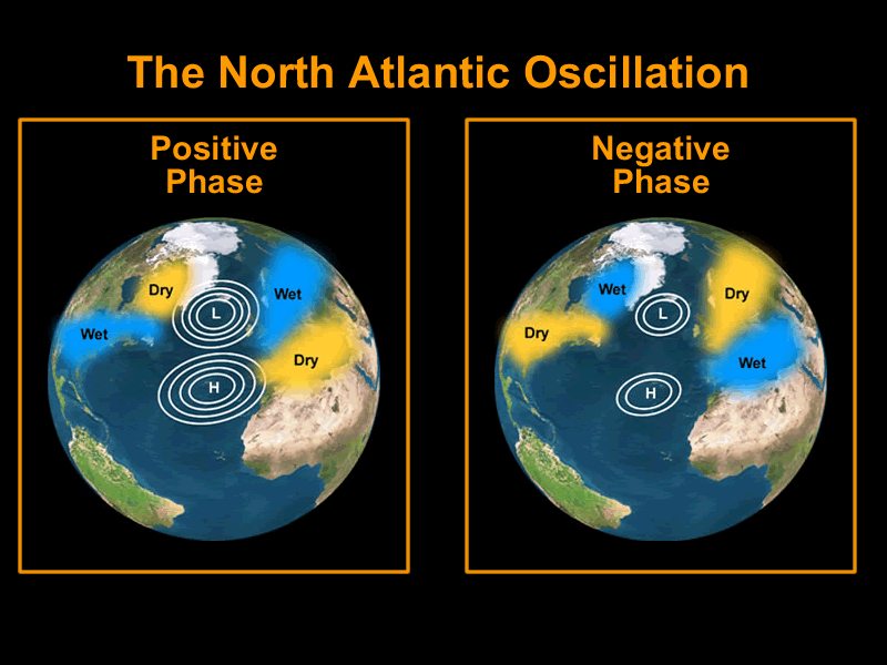
The North Atlantic Oscillation (NAO) can have a large impact on the strength of the jet stream. When the jet stream is weakened its direction can change more often (which is why UK weather can be pretty variable!). The best way to describe the NAO is as a particular state of the atmosphere which can change between so called ‘positive’ and ‘negative’ phases, like a seesaw. These phases are identified by calculating pressure differences between theAzores and Iceland. The Azores has a typically high pressure and Iceland has a low pressure, however this difference can vary in magnitude. The diagram below shows that in a positive phase there is a large difference between high and low pressures, and in a negative phase there is a small difference. If you look closely on the diagram you can see the outline of Europe and Africa to the right of the NAO.
The NAO positive and negative phases. Sourced from here.
Depending on if the NAO is in positive or negative phase then the jet stream is affected differently. The diagram below shows the position of the jet stream when the NAO is positive and negative. In the NAO positive phase the jet stream is coming to the UK from the south west, bringing with it warm, wet air. Conveniently for the UK, in the winter/spring time the jet stream is also pointing in this direction, bringing us wet weather which is relatively warm compared to other places in the world at this latitude. In the negative phase, the jet stream is coming from the north, bringing cooler, much drier air. This may sound like the wrong way around (warm air being experienced in the winter) but this is one of the reasons the UK experiences a temperate climate.
How the Jet stream can change with the phases of the NAO. Modified from original source here.
In the summer of 2007 and 2012 Britain experienced severe flooding and as the NAO was uncharacteristically in its positive phase, and so the jet stream brought with it much more moist air, which turned to rain. The picture below just shows the effect of the NAO in a more simplistic way.
Of course there are many other events that can affect the UK’s weather (the Gulf Stream for example) and there are other types of oscillations that occur elsewhere in the world but this particular one can strongly influence how nice the UK’s summers will be!
The Medieval Warming Period
In my last post (4.5 Billion Years of the Earth’s Temperature) I mention the Medieval Warming Period. This was when Europe experienced higher atmospheric temperatures than today. It occurred between 1000-1400 AD, and it was recently established that the NAO was one of the major driving forces behind this event. It is thought that the NAO was stuck in a very strongly positive phase, blowing vast amounts of warm air over Europe for an extended period of time. For more information on the medieval warming period follow this link.
A Changing Climate
As the global climate changes and the world becomes warmer, it is predicted that this will have an effect on the NAO. The oscillation between positive and negative phases is thought to increase in frequency so we will experience a more variable climate within our normal seasons. This is due to changes in the Earth’s circulation cells which I hope to explain in more detail in another post!
I hope you found this post interesting, as always please post any comments or questions below!
My second post (The Milankovitch Cycles) was recently linked to another blog post. This post, which is a bit more ‘sciencey’ than mine, gives a new approach to the Milankovitch Cycles. It states that the variation in energy on the Earth’s surface because of these cycles is not enough to explain the amount of global temperature variation. It then explains that a recent publication by Abe-Ouchi, A. et al. (2013) can explain these discrepancies using a climate model. Results show that ice-sheets formed on the Canadian Shield are key to the variation in the Earth’s climate. To read the blog post in full please click the link below:
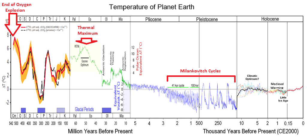
This blog post will give a brief overview of how the Earth’s temperature has changed up to the present day. We only have actual temperature measurements going back a couple of hundred years however there are several other methods we can use to give reliable estimates of the Earth’s temperature in the past. ‘Proxy’ measurements include rock sediment sampling, tree rings and ice cores. The video below gives a good introduction to how the British Antarctic Survey use ice cores to generate accurate atmospheric gas and temperature records going back 800,000 years! The diagram below shows an overview of the Earth’s temperature from 500 million years ago to the present and may help with picturing the changes in temperature when reading this post.
Very Early Earth’s History (4.5 billion – 3.8 billion years ago)
The Earth was formed roughly 4.5 billion years ago. Until 3.8 billion years ago it was a completely inhospitable environment with the surface being mainly molten lava. The Earth eventually cooled enough for its crust to form. Land masses could then exist and, when it was cold enough to rain, the oceans formed. Around this time the atmosphere was predominantly consisted of methane (CH4) and ammonia (NH3), two extremely important greenhouse gases, thus their radiative forcing kept the Earth’s atmosphere warm and toasty!
The Oxygen Explosion (2.5 billion – 500 million years ago)
Oxygen (O2) in the atmosphere was almost non-existent until ~2.5 billion years ago. The evolution of cyanobacteria, which produced oxygen as a bi-product of photosynthesis, meant that O2 levels dramatically increased. This rapid change in atmospheric composition caused widespread extinctions of most of the previous anaerobic bacteria. This ‘new’ atmosphere made the Earth much colder as there were no longer bacteria emitting radiative forcing-methane and carbon dioxide into the atmosphere. It is thought that the average temperature at the equator was roughly the same as current Antarctic conditions!
History of the Earth’s Temperature. originally sourced from here.
500 – 250 million years ago
During this period the Earth’s atmosphere became more stable, eventually cooling to similar temperatures to today’s average (see first section on plot above where the temp change is ~0 ΔT).
Animal Evolution (250 – 65 million years ago)
During this time the evolution of aerobically respiring animals occurred, i.e. DINOSAURS! This meant the concentration of CO2 increased and global temperatures increased again. We know that there was a sudden decrease in temperatures around 65 million years ago which resulted in the extinction of the dinosaurs. The most widely accepted reason for this is a massive comet hitting the Earth sending huge amounts of matter (read: aerosols) into the atmosphere. This caused a global decrease in temperature due to an increased albedo effect (for more information about this and the contribution of aerosols to this effect please read my previous blog: An introduction to aerosols).
Thermal Maximum (55 million years ago)~55 million years ago, records show a massive warming of between 5-8 ⁰C in just 20,000 years (It is thought that during this time it was so warm palm trees could have grown in the poles!). The direct cause is still disputed amongst scientists, however it is generally agreed that a sudden release of carbon into the atmosphere caused the warming. This was probably in the form of methane from either the ocean bed or from within ice structures called clathrates. It was after this period that mammals started to evolve.
Ice Age (35 million years ago)
The thermal maximum continued to around 35 million years ago when the Earth cooled into the Ice Age. The theory behind this change in temperature is that a type of fern named Azolla became extinct. The Azolla then sank to the bottom of the ocean, taking with it much of the carbon absorbed as carbon dioxide, therefore removing it from the atmosphere. With the carbon dioxide not present to act as a greenhouse gas, global temperatures decreased again. Unlike the last period of cooling, this time the Earth had fully formed continents, including mountain ranges, and land mass at the South Pole (Antarctica). This new land coverage helped amplify the cooling via circulation.
An ice age is defined as when a planet’s poles are covered with ice, so technically we are still in one! Within an ice age there are periods of glacials and inter-glacials. Glacials are episodes of colder temperatures whereas inter-glacials are warmer time phases. Both will last several thousands of years. These changes in climate can be explained with the Milankovitch cycles (please read post #2 – The Milankovitch Cycles – for more information). NB: You can see on the plot above sections labelled ‘the mini ice age’ and ‘the medieval warming’ period. I plan to do future blogs on these events as this post is getting far too long!
Recent Warming (1880 – present day)
The warming we have seen in recent years has been like nothing experienced before in the Earth’s history. The last 100 years of warming has cancelled out the previous 6000 years of cooling that occurred before. The video below (sourced from NASA) shows just how dramatic the rate of global warming is over this time period.
Thanks for reading to the end of this post, it ended up a bit too long! Next time I want to introduce an event called the Northern Atlantic Oscillation: the phenomenon that is thought to have caused the medieval warming period.


