What is the IPCC?
The IPCC (Intergovernmental Panel on Climate Change) was set up in 1988 by member governments and established by the World Meteorological Organization (WMO) and the United Nations Environment Programme (UNEP). Its objectives were, and still are, “to assess on a comprehensive, objective, open and transparent basis the scientific, technical and socio-economic information relevant to understanding the scientific basis of risk of human-induced climate change“ (From the Principles Governing IPCC Work). Briefly, the IPCC wants to see how the climate it changing, whether humans are contributing to this change and, if so, how much and what are the impacts on the Earth. The reports that are published every 6 years are based on published scientific research from across the world. Each IPCC report is subdivided into three parts which concentrate on 1) the physical science basis, 2) impacts, adaptation and vulnerability and 3) mitigation of climate change. The most recent report, the 5th (AR5), had its Working Group 1 analysis published in September 2013. It is from this report that the figures I explain in this blogpost originate. To give a sense of scale, AR5 has over 800 contributing scientific authors from over 80 different countries. More than 9000 peer reviewed scientific papers contributed to the reports and over 100,000 comments were made and replied to. In terms of scientific review groups, nothing this comprehensive has been achieved on such a scale in any other discipline. The video below was produced when the Working Group 1 report was published. It gives an overview of the scientific reasoning behind the major statements in the report summary.
Understanding the Terminology
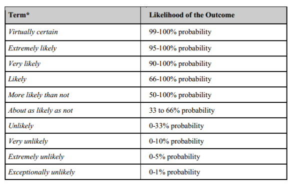
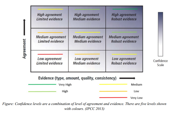
If you have read any news coverage of the AR5 report, or perhaps the ‘Summary to Policy Makers’ you will see it is full of phrases such as ‘extremely likely’ and ‘medium confidence’. These terms all have numerical definitions which are summarised in the figures below, for example, extremely likely has a value of between 95-100% certainty. The values will have been calculated using evidence based on observations, computer models results and scientific expert opinion.
Key Figures in the IPCC AR5 Working Group 1 report
All figures shown below can be found in the Summary to Policy Makers report. All the evidence stated above have been combined and assessed to determine the headline statement of the IPPC AR5 that human contribution to climate change is now extremely likely.
Temperature record of the land, ocean and surface from 1850-2012

Figure SPM.1: (a) Observed global mean combined land and ocean surface temperature anomalies, from 1850 to 2012 from three data sets. Top panel: annual mean values, bottom panel: decadal mean values including the estimate of uncertainty for one dataset (black). Anomalies are relative to the mean of 1961−1990.
This first plot is fairly self-explanatory. It shows the temperature records based on observational evidence for the land, surface (air closest to the ground) and oceans combined. For more information about temperature records that go further back in time, my previous post entitled ‘4.5 Billion Years of the Earth’s Temperature’ has figures and explanations that may interest you. The temperature values are shown as relative to the average temperature from 1961-1990. The period from 1961-1990 is defined as a ‘normal period’ which is an average value from a 30 year duration. A normal period must have an accurate representation of the present-day or recent average climate. This period should feature a range of climatic variations, including several weather anomalies (for example, severe droughts or cool seasons). 1961-1990 is the official normal period adopted by the WMO. For more information about how these periods are defined please see here. The top figure shows the temperature values as annual data points but the bottom has been averaged into decadal (10 year) values (the different colour lines showing different data sets used). The longest data set we have is the one in black, the grey shaded areas shows the spread in uncertainty associated with this data set. You can see the spread of the shaded area is larger the further back in time you go, showing how our confidence in our observations has improved as more robust measuring techniques are introduced. The first seven decades (the Industrial Revolution) show almost no trend in temperature (if anything a slight decrease in global values) however temperature rises from the 1920s to the 1950s. A plateau is then observed for a few decades before values dramatically rise to present day values. The last three decades have been warmer than any other decade in the last 150 years.
Surface temperature change from 1901-2012
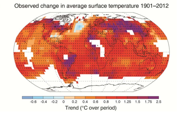
Figure SPM.1: (b) Map of the observed surface temperature change from 1901 to 2012 derived from temperature trends determined by linear regression from one dataset (orange line in panel a). Trends have been calculated where data availability permits a robust estimate (i.e., only for grid boxes with greater than 70% complete records and more than 20% data availability in the first and last 10% of the time period). Other areas are white. Grid boxes where the trend is significant at the 10% level are indicated by a + sign. For a listing of the datasets and further technical details see the Technical Summary Supplementary Material. {Figures 2.19–2.21; Figure TS.2}
This figure gives more information than the one before by showing where in the world the temperature change is occurring. It is sometimes assumed that the rate of global warming is the same throughout the world, but this is not the case. You can see the most intense warming occurs over large land masses. It should be noted that the areas marked with a + sign show when the temperature change is above 10% of the starting temperature which indicates a relatively significant change. Not all areas of the world are warming however, as the blue indicates in the North Atlantic Ocean, there are also certain parts of Antarctica that are cooling but this is not shown in this diagram. As stated in the figure description, the white regions are where <70% of the total data set is recorded and more than 20% of the total data set is in the first and last time periods. Without this information the exact value of temperature change cannot be calculated. This is not to say scientists do not know if these regions are warming or cooling, but the values calculated are not robust enough to the stated here.
Change in rainfall over land from 1901-2010
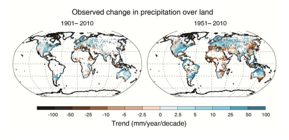
Figure SPM.2 | Maps of observed precipitation change from 1901 to 2010 and from 1951 to 2010 (trends in annual accumulation calculated using the same criteria as in Figure SPM.1) from one data set. For further technical details see the Technical Summary Supplementary Material. {TS TFE.1, Figure 2; Figure 2.29}
This figure shows the change in rainfall over two periods in the last 110 years. Like the figure before areas of white on the land surface indicates where there is not enough data to be able to calculate a value. By comparing the two figures it is clear that we are much more confident in our values for the second half of the 20th century as there are fewer white gaps. This is due to a much larger network of measurements being taken, including satellite data and ground based stations. Africa and South East Asia received less and less rain throughout the 20th century, whereas Europe and the Americas experienced more. The North West coast of Australia has got wetter but the South and East coasts have got drier (this is particularly important as most of the populations of Australia live on the East Coast). This change in rainfall will have a very large impact on societies across the world, both negative and positive. The IPCC Working Group 2 will publish a report in March 2014 concentrating more on the impacts of climate change for the past, present and future.
Comparison of temperature values calculated using computer model results and measured observations
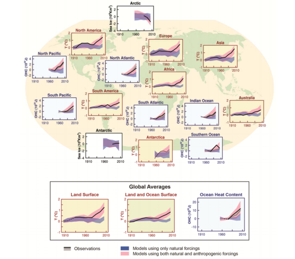
Figure SPM.6 | Comparison of observed and simulated climate change based on three large-scale indicators in the atmosphere, the cryosphere and the ocean: change in continental land surface air temperatures (yellow panels), Arctic and Antarctic September sea ice extent (white panels), and upper ocean heat content in the major ocean basins (blue panels). Global average changes are also given. Anomalies are given relative to 1880–1919 for surface temperatures, 1960–1980 for ocean heat content and 1979–1999 for sea ice. All time-series are decadal averages, plotted at the centre of the decade. For temperature panels, observations are dashed lines if the spatial coverage of areas being examined is below 50%. For ocean heat content and sea ice panels the solid line is where the coverage of data is good and higher in quality, and the dashed line is where the data coverage is only adequate, and thus, uncertainty is larger. Model results shown are Coupled Model Intercomparison Project Phase 5 (CMIP5) multi-model ensemble ranges, with shaded bands indicating the 5 to 95% confidence intervals. For further technical details, including region definitions see the Technical Summary Supplementary Material. {Figure 10.21; Figure TS.12}
This figure has a lot of information and can appear quite complex. The individual graphs show computer model values and real measurement values for different regions of the globe. The yellow boxes are temperature values for the land and the white are for the oceans/seas. There are two different types of model simulations here, one where only natural processes that drive changes in climate are considered (for example solar variability, aerosols from volcanic eruptions etc.) These model runs are shown in purple. There are many different computer models in the world and all will produce slightly different results, which is why the pink lines are shown as shaded areas to show the spread in results, or the uncertainty associated with these models. The pink shaded lines show computer model results where both the natural climate forcings AND human forcing are considered in their runs. For example, these will include fossil fuel emissions, CFC emissions etc. Crucially, in all of the graphs in this figure, the only way for the model results to agree with the measured observations (shown as thin black lines) occurs when both natural and human climate forcings are considered.
Current Radiative Forcing Estimates compared to 1750 values
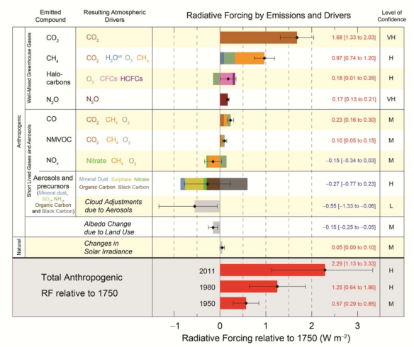
Figure SPM.6 | Radiative forcing estimates in 2011 relative to 1750 and aggregated uncertainties for the main drivers of climate change. Values are global average radiative forcing (RF14), partitioned according to the emitted compounds or processes that result in a combination of drivers. The best estimates of the net radiative forcing are shown as black diamonds with corresponding uncertainty intervals; the numerical values are provided on the right of the figure, together with the confidence level in the net forcing (VH – very high, H – high, M – medium, L – low, VL – very low). Albedo forcing due to black carbon on snow and ice is included in the black carbon aerosol bar. Small forcings due to contrails (0.05 W m–2, including contrail induced cirrus) and HFCs, PFCs and SF6 (total 0.03 W m–2) are not shown. Concentration-based RFs for gases can be obtained by summing the like-coloured bars. Volcanic forcing is not included as its episodic nature makes is difficult to compare to other forcing mechanisms. Total anthropogenic radiative forcing is provided for three different years relative to 1750. For further technical details, including uncertainty ranges associated with individual components and processes, see the Technical Summary Supplementary Material. {8.5; Figures 8.14–8.18; Figures TS.6 and TS.7}
For a specific definition of radiative forcing please read the beginning of my first blog ‘A brief introduction to Global Warming’ but essentially a positive radiative forcing (RF) means a warming of the atmosphere and a negative means a cooling. The figure above shows the contributors to climate change. This figure has been developed from the previous report published by the IPCC in 2008. This new figure now shows how each factor can affect temperature (the second from the left column). For example, the top compound carbon dioxide (CO2) warms the atmosphere directly by being present in the atmosphere however when looking at the methane value (CH4) there are four compounds in the second from left column. This means that not only does methane warm the atmosphere directly but when it reacts with other compounds in the atmosphere and produces water (H20), ozone (O3) or carbon dioxide (CO2) then these also warm the atmosphere. The corresponding colours on the bar to the right show how much of this warming is because of which process. The majority factor being direct warming from methane itself but then warming from ozone (produced whem methane reacts in the atmosphere) also has a large contribution. Aerosols can have both a warming and cooling effect on atmospheric temperatures. In the 5th IPCC report it is now possible to see which types of aerosols warm and which cool and by how much (for more information about aerosols please read by blog ‘A brief Introduction to Aerosols’). Our confidence for the RF values are stated in the right column.
Temperature predictions to the year 2100 with different RCP scenarios

Figure SPM.7 | CMIP5 multi-model simulated time series from 1950 to 2100 for (a) change in global annual mean surface temperature relative to 1986–2005.
Governments, policy makers and climate scientists have all resolved four different representative concentration pathway (RCP) scenarios to predict the average global temperature leading up to 2100. These four RCP values relate to what the radiative forcing could be by 2100 and are 2.6, 4.5, 6.0 and 8.5 respectively. For example, the RCP 2.6 has a radiative forcing of 2.6 (very similar to today’s values – see graph below) whereas a RCP value of 8.5 has over 3 times the amount of warming by 2100. The figure above shows that there could be a huge difference in global average temperature depending of which RCP scenario the world adopts. To get a sense of perspective, for the RCP 2.6 scenario the world must adopt a very strict reduction of greenhouse gas (GHG) emissions – this is effectively the ’best case scenario’. The RCP 8.5 is a ‘business as usual’ scenario where we make little or no reductions of GHG emissions. It should be noted that we are currently (as a globe) doing slightly worse than the RCP 8.5 scenario due to an increase in power production in developing countries and a failure to strictly reduce current emissions. It is generally agreed that a temperature increase of 4 ⁰C would have significant impacts on global society.
I hope you have enjoyed reading this post, I have certainly tried to cram a lot of information here! For anyone who is interested, one of the lead authors of the IPCC AR5, Prof. Piers Forster, summarised the report in 18 tweets.They are well worth a read and may help to summarise some of the things written in this post. The link to these tweets can be found here.

